
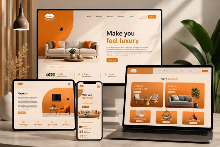
A customer may discover your business on a laptop, visit your website again from a phone and later return using a tablet.
They should not have to think about which device they are using.
Your website should simply work.
This is the purpose of responsive web design.
What is responsive web design?
Responsive web design is the approach of creating a website that automatically adapts to the screen size and device being used.
Instead of creating completely separate websites for desktop and mobile users, a responsive website adjusts its layout, images, text, navigation and other elements to provide an appropriate experience across different screens.
This is especially important because people no longer access websites from one type of device.
A business website needs to work wherever its customers are.
Your customers are using different devices
Think about how you use the internet yourself.
You might use a laptop when working, a phone when travelling and a tablet when relaxing at home.
Your customers behave in similar ways.
Someone might first see your business through a search engine on their phone. Another person might visit your website from a desktop computer at work.
Both visitors are interacting with the same business.
That means both should receive a professional experience.
A desktop website is not automatically a mobile website
One of the common mistakes businesses make is designing a website primarily for large screens and assuming that it will automatically work well on smaller ones.
It does not.
A layout that looks excellent on a desktop can become difficult to use on a phone.
Text can become too small.
Images can become oversized.
Buttons can become difficult to tap.
Navigation can become confusing.
Content can become cramped or require unnecessary horizontal scrolling.
Responsive design addresses these problems by adapting the layout to the available screen space.
Mobile users need a different experience
Responsive design is not simply about making everything smaller.
A good mobile experience may require elements to be rearranged.
A desktop navigation menu may become a mobile menu.
Two columns may become one.
Large images may be resized or repositioned.
Buttons may become easier to tap.
Text may use different sizes and spacing.
The goal is to make the content comfortable and easy to use on the device.
Good design should support the customer journey
A website is not only something customers look at.
It is something they use.
They may be trying to learn about your company, compare your services, view your work, contact your team or make a purchase.
Every part of that journey should remain easy to understand regardless of the device.
If a customer struggles to navigate your website on their phone, the quality of the business can be judged by that experience even if the company itself provides excellent products or services.
Responsive design can strengthen your brand
Your website is often one of the first places where someone experiences your business.
A website that looks polished on desktop but feels broken on mobile creates an inconsistent impression.
A responsive website helps maintain the same brand experience across different devices.
Typography, colours, imagery, spacing and navigation can all be designed to work together at different screen sizes.
This creates a more consistent digital presence.
Images need to work across screen sizes
Large, high-quality images can make a website look impressive.
But an image that works well on a large monitor may dominate the screen on a phone.
Responsive websites need to control image sizes and positioning so visuals support the content rather than getting in the way of it.
The same principle applies to banners, videos, product images and other visual elements.
Responsive websites can make businesses easier to use
Good technology should remove unnecessary friction.
If a customer can quickly find your services, understand what you offer and contact you without struggling with the website, the digital experience is doing its job.
Responsive design contributes to that experience by making the website easier to use across different environments.
Responsive design is part of a larger digital strategy
A responsive website is important, but it is only one part of a strong digital presence.
Businesses also need to think about website performance, search engine optimisation, content, security, hosting, maintenance and how their website connects with the systems used by the business.
A website should not exist in isolation.
It should support the way the business attracts customers, communicates with them and operates every day.
Your website should be ready for the way people browse today
Customers will continue to use different devices to interact with businesses.
That means a website should not be designed around one screen size.
It should be designed around the people using it.
A responsive website gives your customers a more consistent experience, makes information easier to access and helps your business maintain a professional digital presence across devices.
At Commuc Technologies, we build websites and digital systems designed around how modern businesses need to operate, connect with customers and grow.